
Skip to content
Amana Finishes
Colour9 min read

Choosing Interior Paint Colours That Work in GTA Light

Undertones, northern light, and the sampling method that prevents the most common and expensive colour mistake.
Published July 8, 2026Updated August 1, 2026
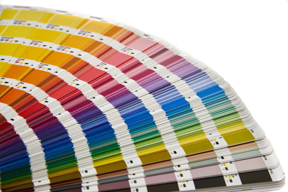
Paint colour swatches and sample boards against a wall in natural light
The short answer

The most common colour mistake is choosing from a small chip under store lighting. Toronto sits at roughly 43° north, which means low-angle winter light and long overcast stretches that pull cool undertones forward, a warm greige can read distinctly grey or even purple on a north-facing wall from November to March. Always test with large sample boards, at least A3 size, viewed against the actual wall at three different times of day before committing.

01

Why the chip lies

A paint chip is roughly 50 mm across and viewed under retail lighting, usually fluorescent or LED at a colour temperature nothing like your living room. Your wall is several square metres, viewed under whatever light comes through your windows at that hour, and surrounded by your floor, your furniture and your trim, all of which bounce their own colour onto it.

Colour also intensifies with area. A pale grey that reads as a subtle neutral on a chip can read as a distinctly cold, saturated grey across a whole wall. This is the single most common reason people repaint within a year, and it is entirely avoidable.

02

Undertones: the thing that actually goes wrong

Almost no paint colour is a pure hue. Greys carry a blue, green, purple or brown undertone. Whites carry yellow, pink, green or blue. Beiges carry pink, yellow or green. The undertone is invisible on a chip and unmissable on a wall.

It becomes obvious in two situations: against another colour, and under directional light. A grey with a purple undertone sitting beside a white with a yellow undertone will look wrong to you without your being able to explain why, the eye detects the conflict long before the brain names it.

The practical method is comparison. Put your candidate against two or three other colours in the same family and the undertone jumps out immediately. A "warm grey" only looks warm next to a cooler one.

03

Toronto light, specifically

The GTA sits at about 43° north. Winter sun stays low, and the region gets long stretches of overcast weather from November through March. Overcast light is cool and diffuse, and it pulls cool undertones forward in everything it touches.

That means a colour selected in July can behave quite differently in January. A warm greige that looked cosy in summer sun can read flat and grey, sometimes faintly purple, under five months of Toronto cloud.

Exposure matters as much as season:

Room facesLight qualityWhat to do
NorthCool, indirect, consistent all dayWarm the colour more than feels necessary. Cool greys go cold here
SouthWarm, bright, strong through the dayAlmost anything works. Cool colours are balanced rather than chilled
EastWarm early, cool and flat after noonTest in the afternoon, that is the harder condition
WestFlat in the morning, intense warm light lateTest late afternoon; warm colours can become overwhelming
BasementLittle or no natural lightWarm tones and higher LRV. Cool greys read as concrete
04

How to test properly

  • Buy sample pots, not chips. Two coats, on primed card, at least A3 size, larger is better.
  • Paint boards rather than the wall. A board can be moved around the room and held against the trim, the floor and the furniture.
  • Leave a white margin around each sample so the existing wall colour does not contaminate your perception of it.
  • View at three times: morning, mid-afternoon and after dark under your actual lamps. Artificial light at night is where a lot of colours fall apart.
  • Look at it against the floor and the trim. Those two surfaces bounce more colour onto your wall than anything else in the room.
  • Live with it for at least three days. First impressions of colour are unreliable and reliably change.
05

LRV: the one number worth learning

Light Reflectance Value runs from 0 (absorbs all light) to 100 (reflects all light), and it is printed on most manufacturer colour data. It is the most useful single number in colour selection and almost nobody uses it.

As a rough guide: above 70 reads as a light colour and bounces light around a room, 50 to 70 is a mid-tone, and below 50 is a genuinely dark colour that will absorb light and make a room feel smaller.

For a basement or a north-facing room, an LRV above 60 is usually necessary to keep the space from feeling closed in. For a dramatic dining room or a library with good light, going below 30 is where the effect people actually want lives.

06

Practical guidance that holds up

  • Ceilings: keep them lighter than the walls unless you are deliberately making a room feel enclosed. Flat finish, always.
  • Trim: a white with a similar undertone to your wall colour. A cool white against a warm wall reads as a mistake rather than a contrast.
  • Open-plan spaces: one wall colour throughout, with variation delivered through millwork and accent surfaces. Multiple wall colours in a sightline rarely works.
  • Small rooms: dark colours do not make small rooms feel smaller, that is a myth. They make them feel enclosed and intentional, which in a powder room or a study is exactly the point.
  • Resale: neutral does not have to mean beige. A warm off-white with a considered trim colour presents better than a builder-grade flat white and costs the same.
  • Commit to an undertone across the house. Warm neutrals throughout, or cool ones throughout, mixing them room to room is what makes a house feel incoherent without anyone being able to say why.
Want this priced for your house?

General ranges only get you so far. A 45-minute walkthrough gives you a written finish specification and a fixed number, free, and with nothing to sign.

Questions

Related questions we get asked.

Why does my paint look different on the wall than on the chip?

Three reasons compounding. Scale, colour intensifies as area increases, so a subtle chip becomes a saturated wall. Lighting, store lighting is nothing like your window light or your evening lamps. And surrounding colour, your floor, trim and furniture all bounce their own tint onto the wall, which a chip held in your hand never experiences. This is why large sample boards viewed in the actual room at several times of day are the only reliable method.

What colours work best in a north-facing room?

Warmer ones than you think you need. North-facing rooms in Toronto get cool, indirect light all day and no direct sun, which pulls cool undertones forward in everything. A grey that reads as a warm greige in a south-facing room can look distinctly cold or faintly purple on a north wall. Choose colours with a genuine warm undertone, soft warm whites, warm greiges, muted earth tones, and be sceptical of anything described as a cool grey.

How many sample colours should I test?

Three to five per room, no more. Beyond five, comparison becomes harder rather than easier and people end up more confused than when they started. Narrow to a shortlist using chips, then commit to proper large sample boards for the final few. Testing two is usually too few to reveal undertone, since undertone is a relative property that only becomes visible in comparison.

Should every room in the house be the same colour?

Not necessarily, but every room should share an undertone family. Warm neutrals throughout, or cool ones throughout, mixing warm and cool wall colours between rooms that are visible from one another is what makes a house feel subtly incoherent. Within a consistent undertone family you can vary depth and saturation freely, and open-plan spaces in particular are best served by one wall colour with the variation delivered through trim, millwork and furnishings.

Keep reading
Book a free walkthrough

Tell us what needs painting

Free walkthrough, a fixed written quote, and no obligation to go ahead.

  • 1,000+ homes painted
  • Free walkthroughs
  • Fixed written quotes
  • Serving Toronto and the GTA

No obligation. We reply within one business day.